
What is Responsive Web Design?
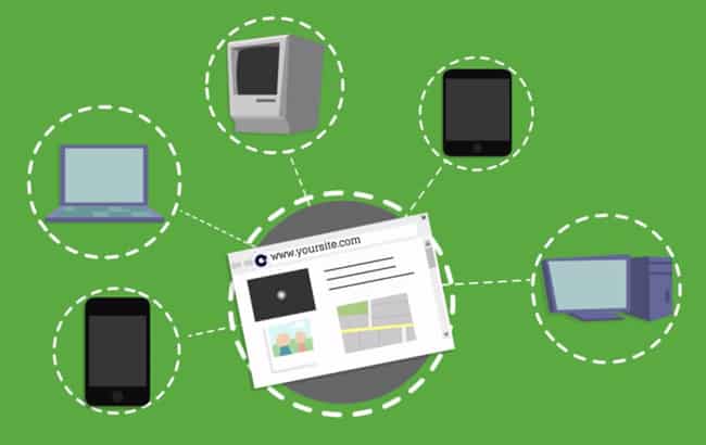
With so many people asking about Responsive Web Design, we’re taking a moment to clear things up.
RWD (Responsive Web Design) is a flexible, grid-base layout that “responds” to the size of your internet browser. All website content, such as text, images and videos, will resize to fit the browser window on any device!
Intrigued? Want to learn what this new technology can do for your website(s)? Check out our quick explanatory video about Responsive Web Design below.
The Ultimate Guide to B2B Web Design
Check out the Ultimate Guide to B2B Web Design and download our checklist!
B2B Web Design Guide